SafePal
Mobile App
Web3
iOS + Android
A full redesign of a leading crypto wallet app. Seven weeks from brief to handoff, designed at Unfold.
Context
SafePal had the users. The product had not kept up. Features had accumulated faster than the interface around them, with no coherent visual system holding it together.
- Navigation did not reflect how users actually moved through the product
- Complex features like DeFi, DApps, and cross-chain swaps were buried or inconsistently surfaced
- The visual design lacked coherence across screens and feature areas
- The app served both crypto newcomers and power users, with no clear accommodation for either
Role
Lead Product Designer, Unfold · 7 weeks
What I owned
- Led UX and UI across half the product, including wallet and transaction flows
- Drove decisions on navigation architecture, hierarchy, and component structure
- Built out the design system alongside the second designer, with clear ownership over my screen set
- Led design sessions with SafePal stakeholders and managed feedback rounds
- Contributed to handoff documentation and final specs for engineering
Requirements
Before any design work began, I mapped the full feature scope with stakeholders. These requirements were defined at kickoff as a shared checklist to keep the team aligned throughout.
Decisions
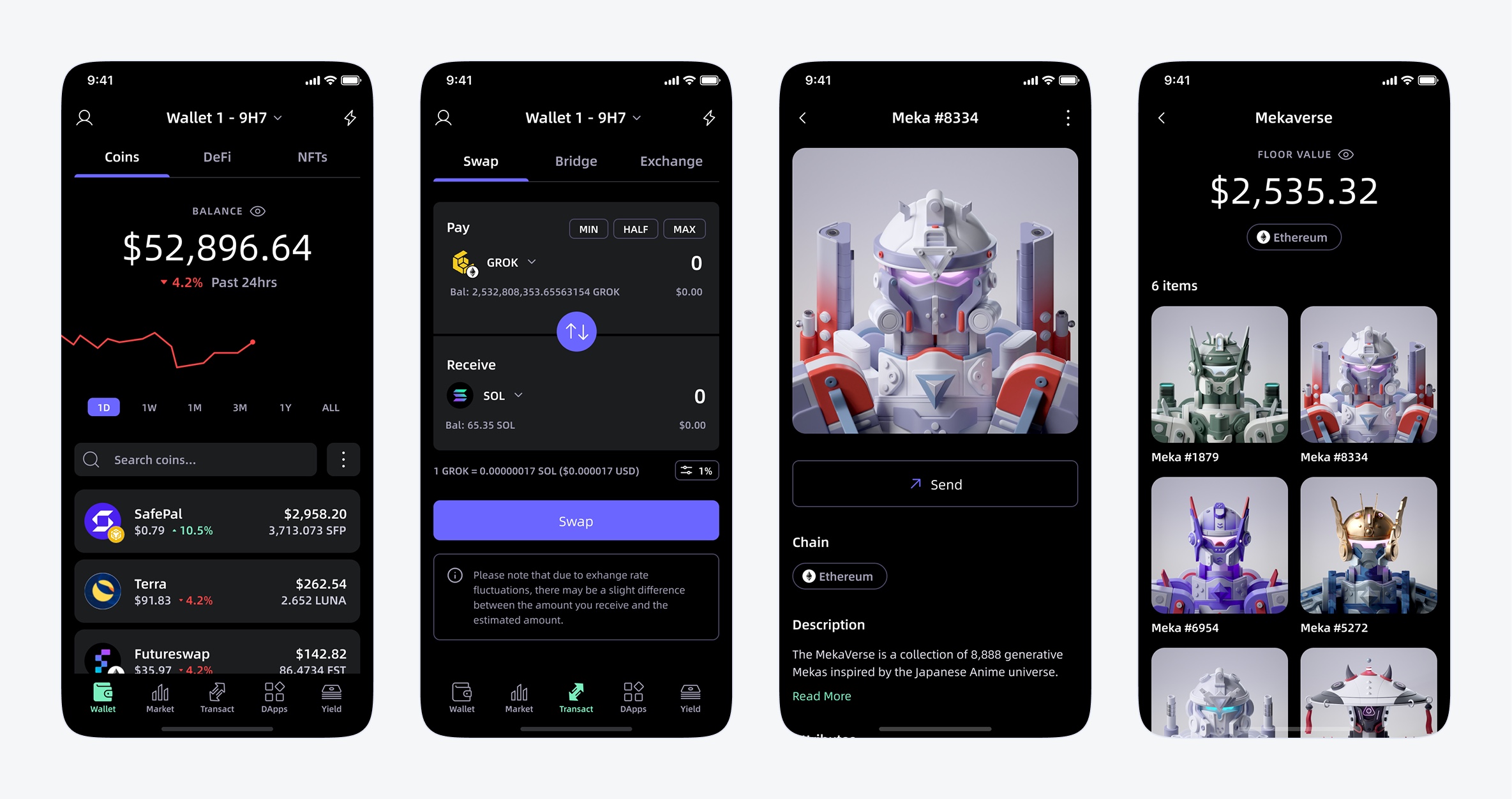
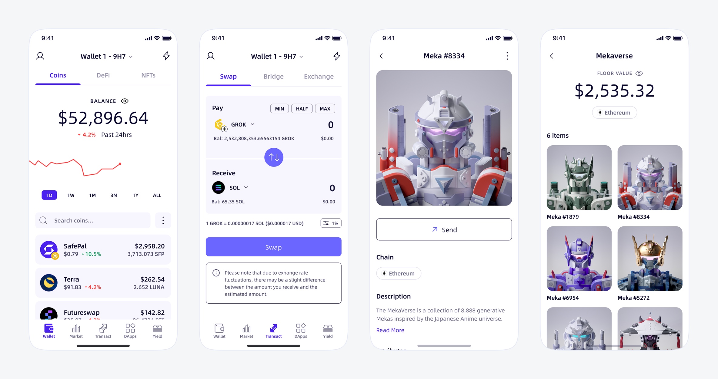
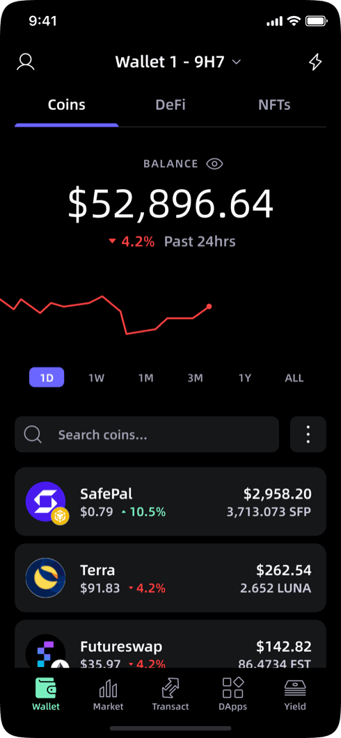
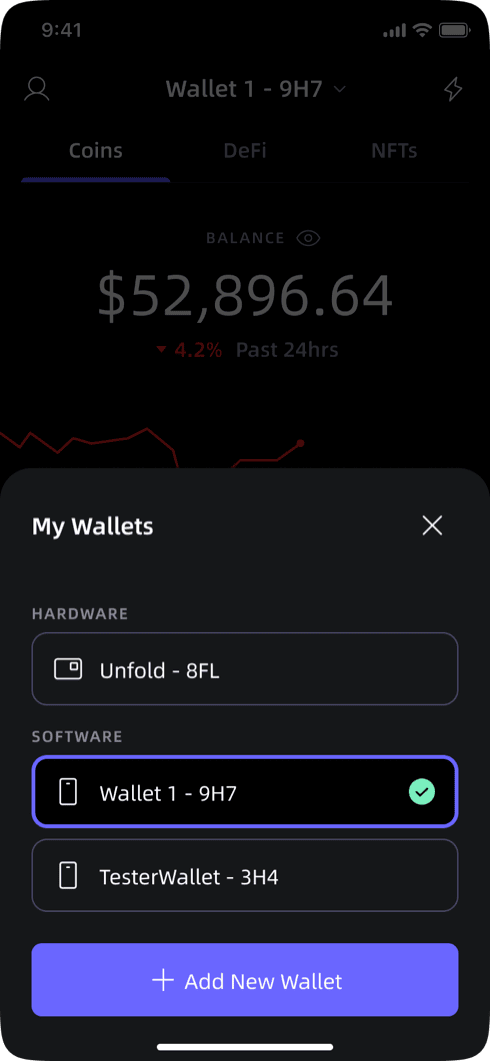
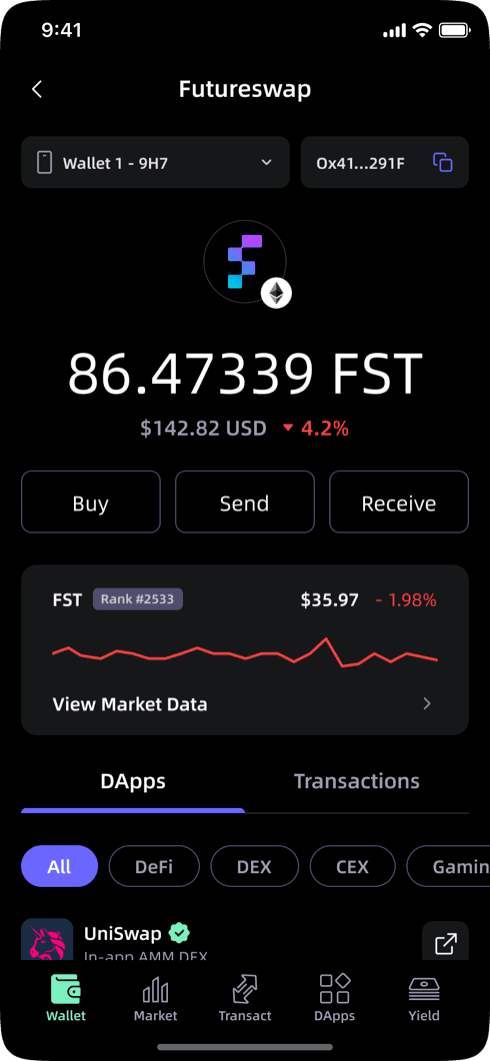
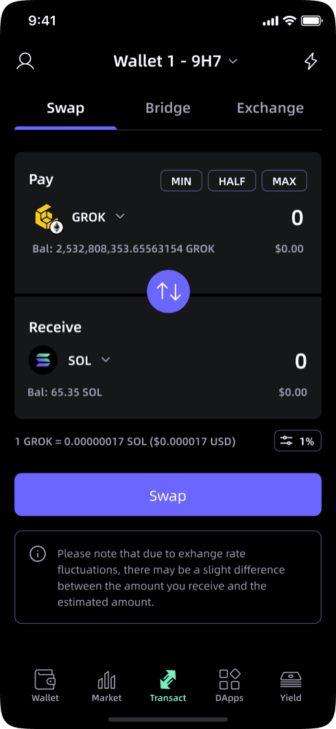
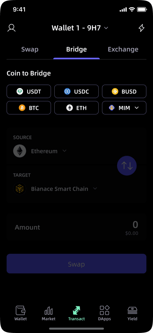
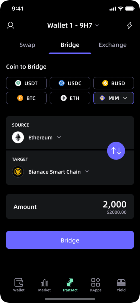
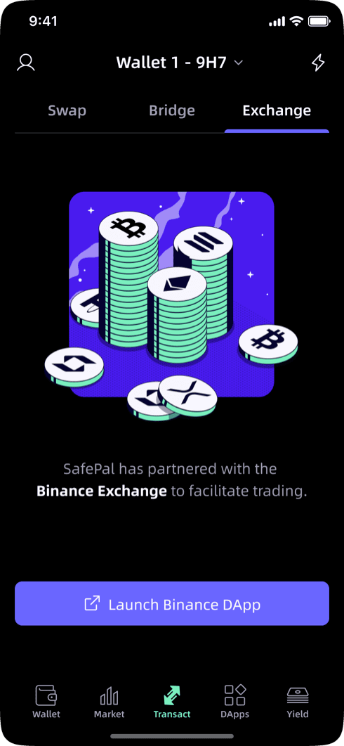
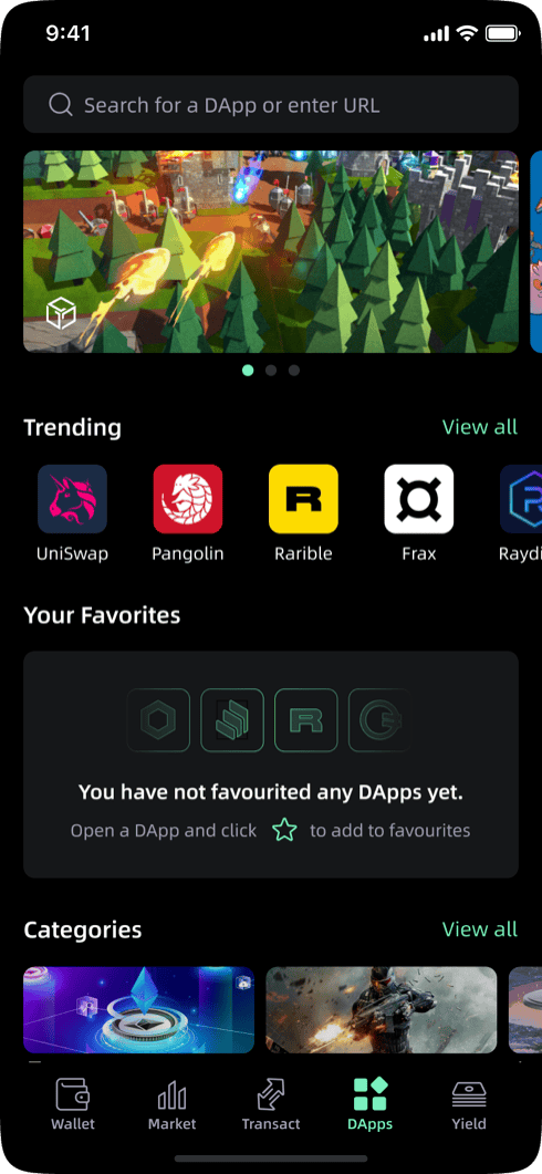
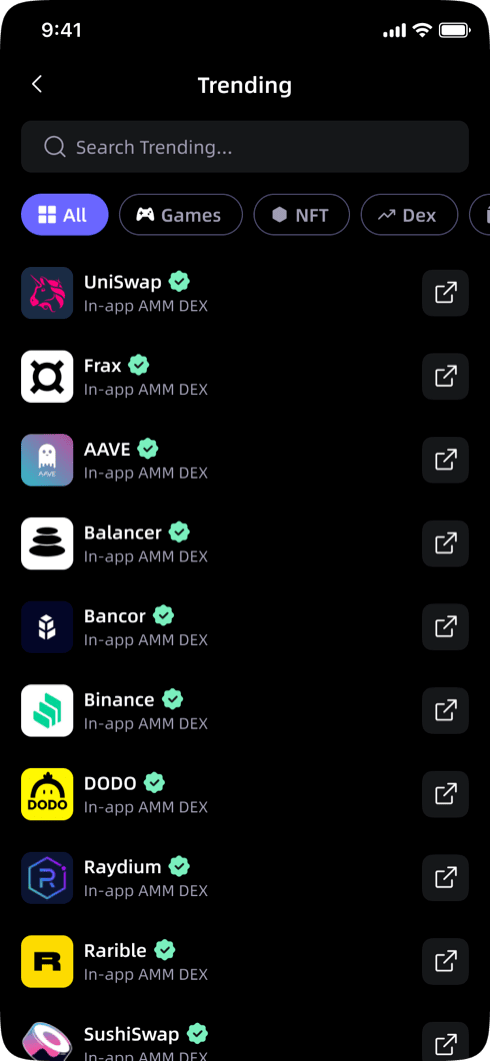
We restructured navigation around what users actually do. Features had accumulated without consistent logic to where they lived. We rebuilt around three core actions: checking balances, swapping, and accessing DApps. DApps and NFTs had been given equal weight to the wallet core despite low usage. Usage drove the hierarchy.
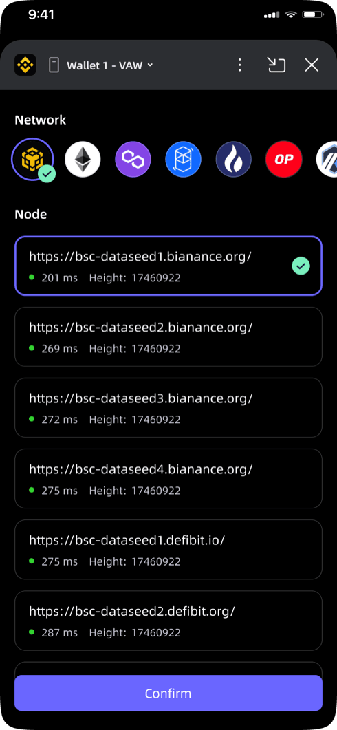
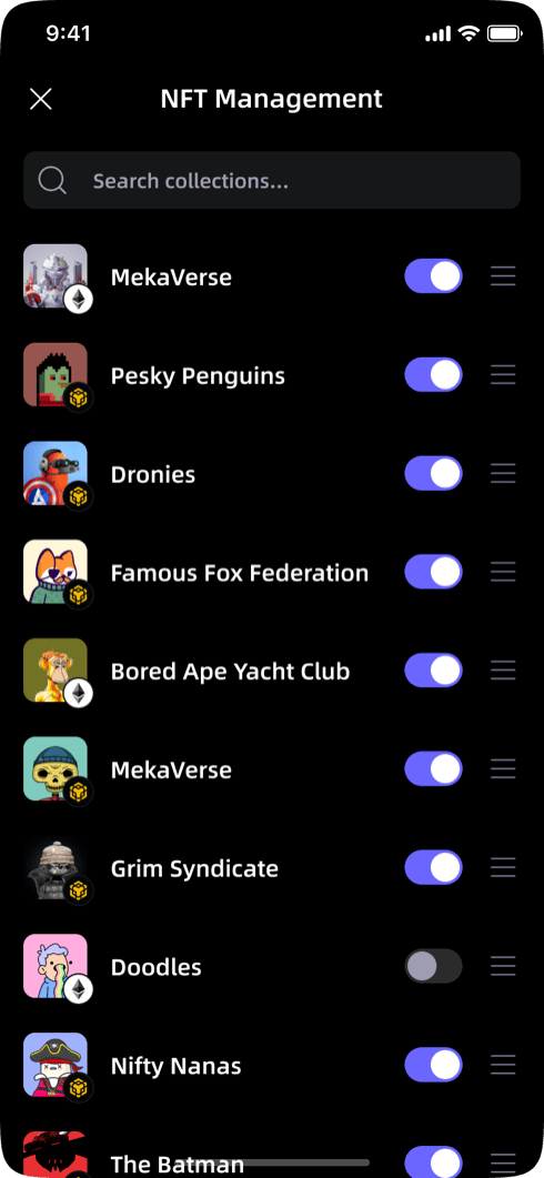
We built the design system first. SafePal covers wallet, exchange, DApps, NFTs, and settings. A shared component library for light and dark mode kept every screen visually consistent.
We designed for two audiences without building two products. Users range from first-time crypto owners to experienced traders running multi-chain strategies. Core flows are approachable by default; DeFi tools and advanced settings sit one layer deeper, visible but non-dominant. One product, two entry points.
Shipped
A full redesign of a multi-feature crypto wallet used across iOS and Android. Polished, systematized, and handed off ready to build.
What shipped
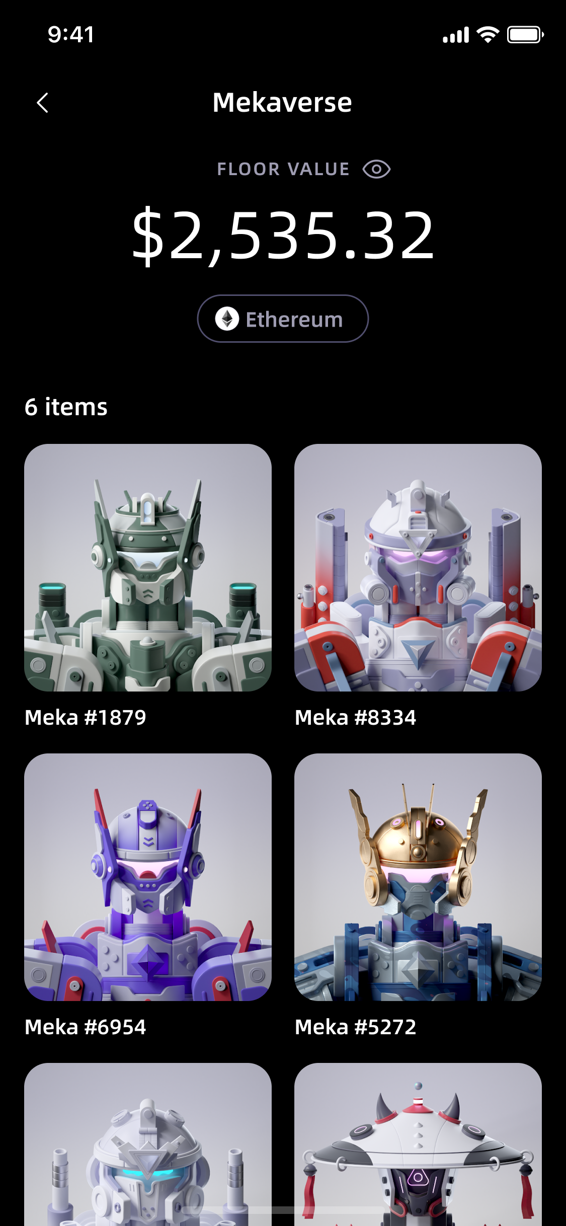
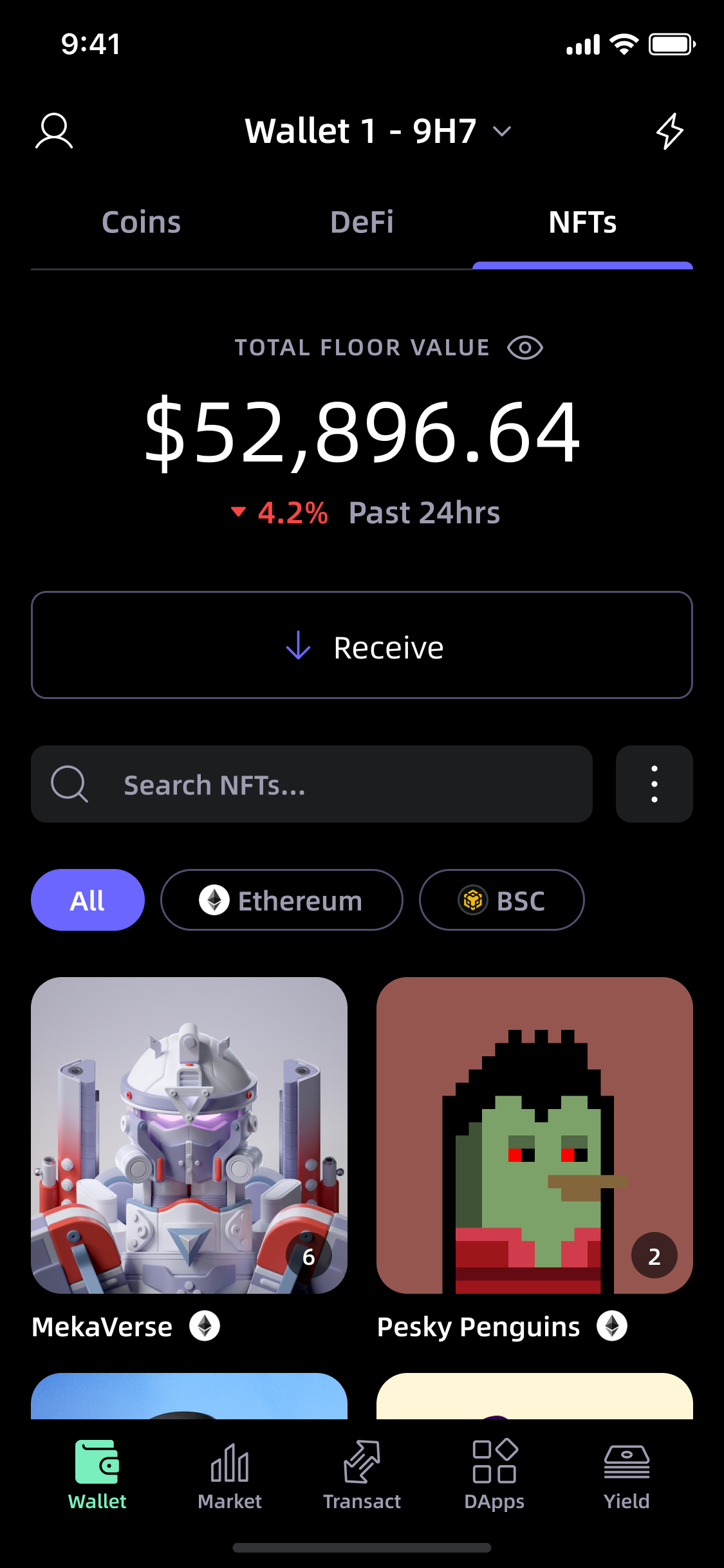
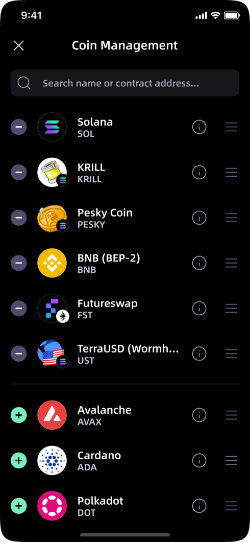
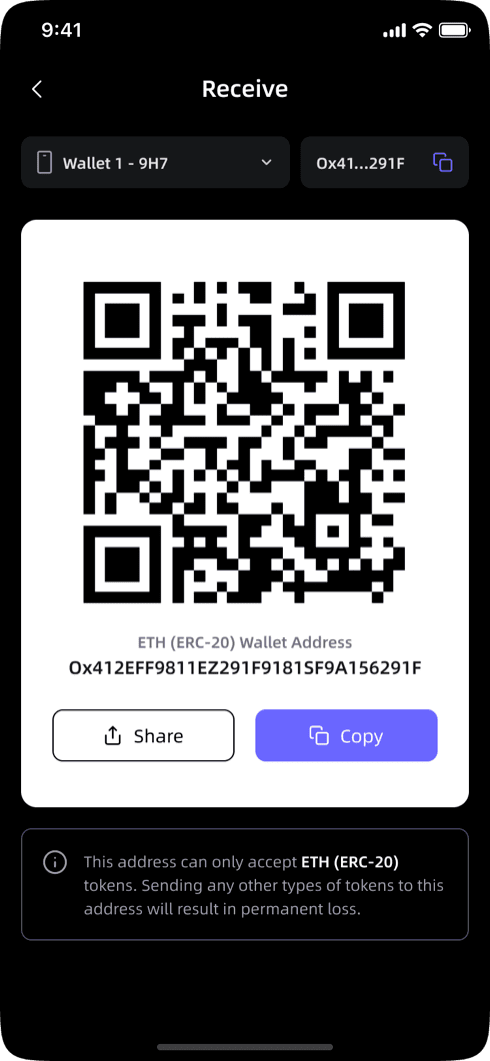
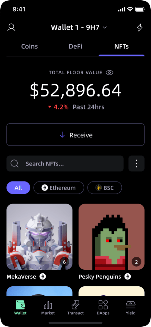
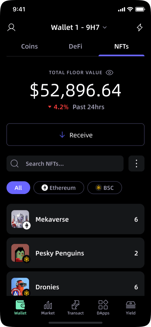
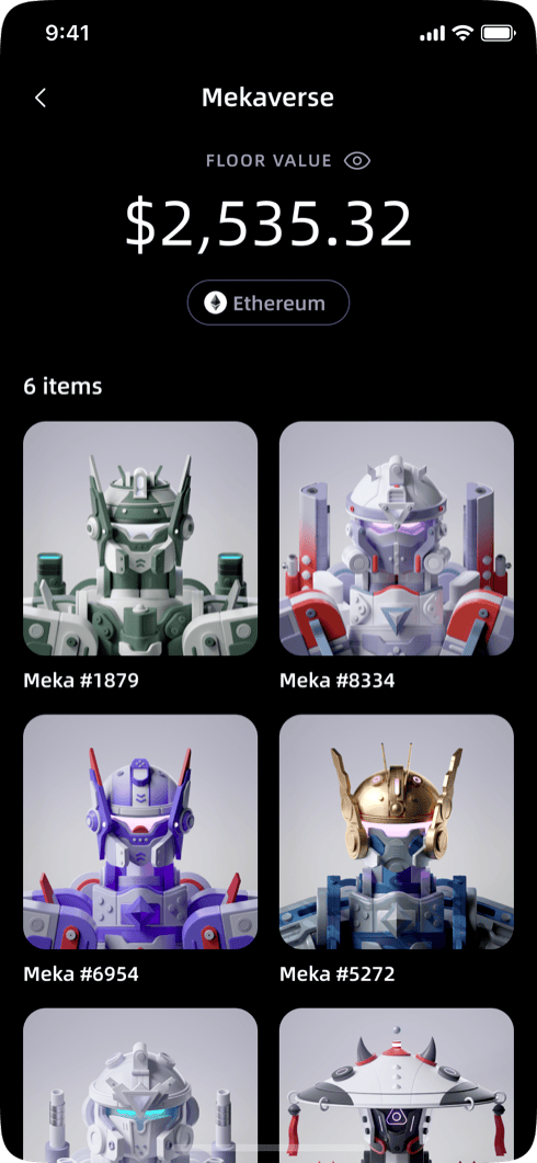
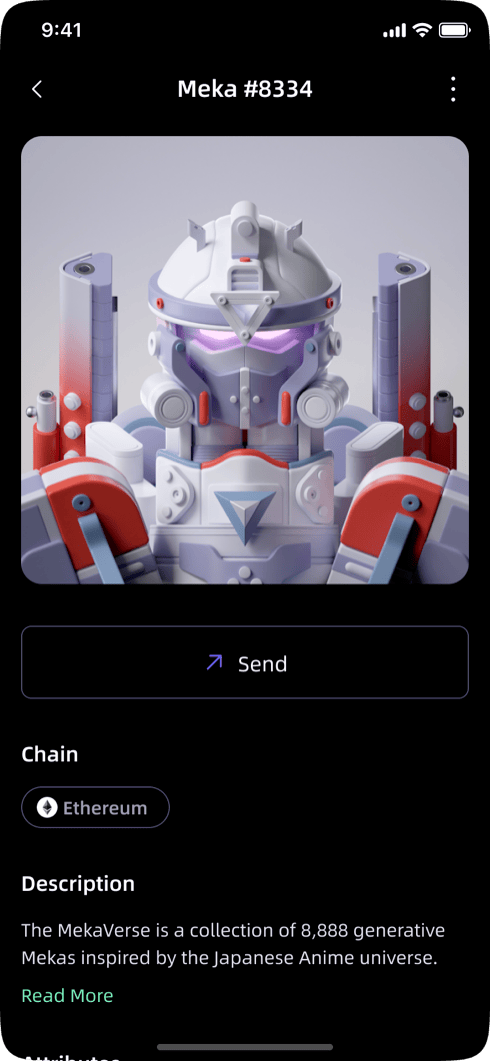
- Home/Coins: portfolio overview and asset management
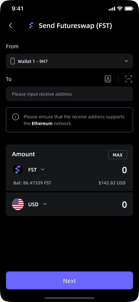
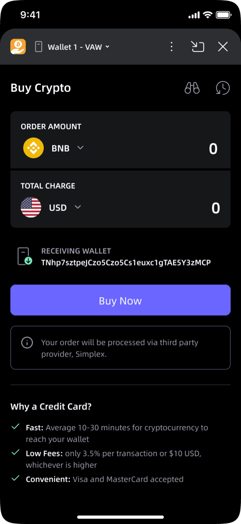
- Swap/Bridge/Exchange: cross-chain transaction flows
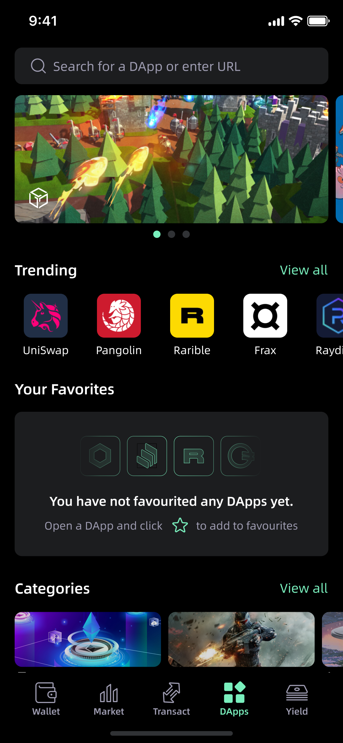
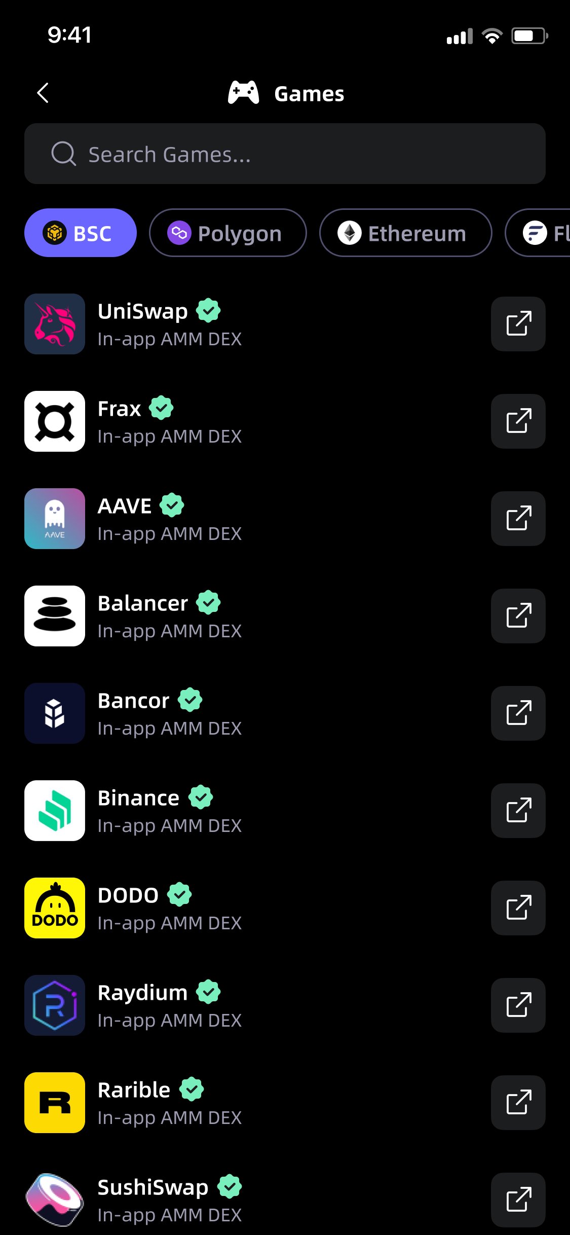
- DApps: decentralized application browser and access layer
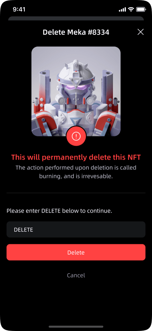
- NFT Index and Collection: NFT portfolio management and display
- Full component library and design system documentation

Build
SafePal covers wallet management, DeFi tools, NFT collections, and more. The design system had to hold all of it.
Two designers working in parallel required clear ownership from the start. Each owned a defined screen set and drew from a shared component library: consistent tokens, variants, and documented states throughout. Handoff documentation was produced at the component level so engineering could build without ambiguity.
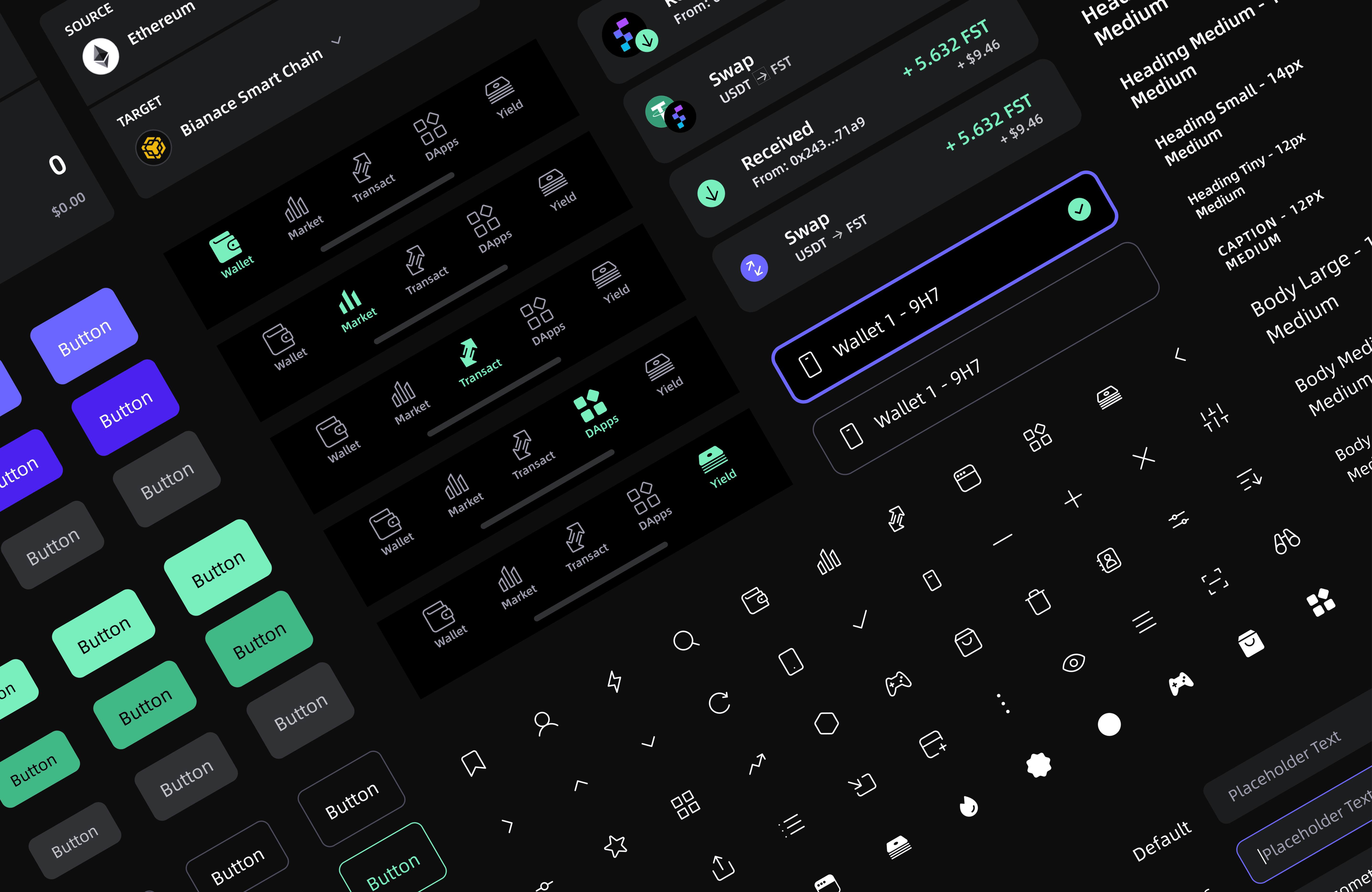
Design system components
Results
SafePal serves 20 million users across 196 countries, backed by Binance Labs. The redesign delivered a coherent visual system, restructured navigation, and a component library.
Learnings
Seven weeks across this much surface area required clear prioritization. The two-designer structure worked because ownership was defined early. Ambiguity about who owned what would have created inconsistency. Clear lanes made the pace possible.
The design system was the real multiplier. Decisions made at the component level rippled outward to every screen. Right calls compounded quickly; wrong ones were faster to fix than if we'd designed screen by screen. On a project with this scope, the system is the product.
Other works